Client: Engadin Hockey Club St. Moritz
Project: New visual identity
Role: Low level brand audit, brand Strategy, layout, artwork, web development, concept collaboration with Creative Director
Year: 2020
Engadine Hockey Club St. Moritz Visual Identity
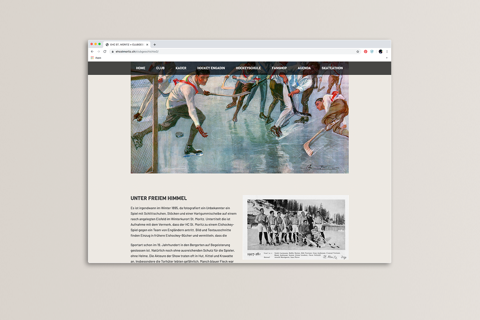
The client project scope was to focus on its historical roots as well as their vision to foster new talent.
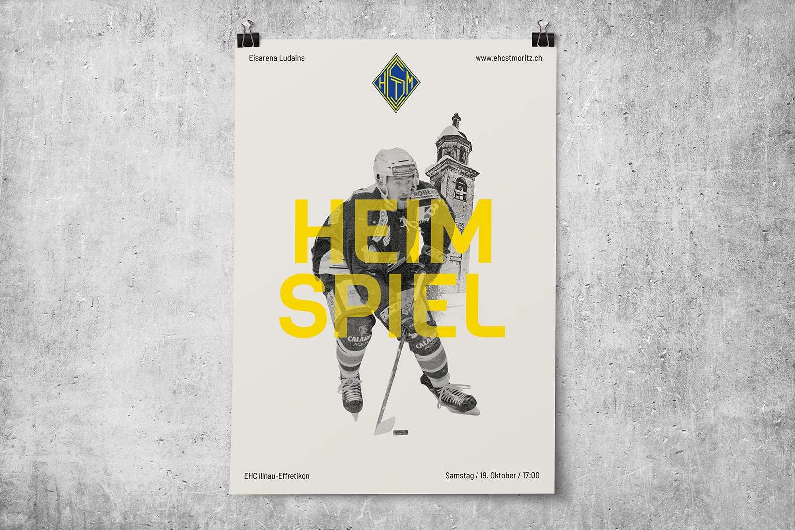
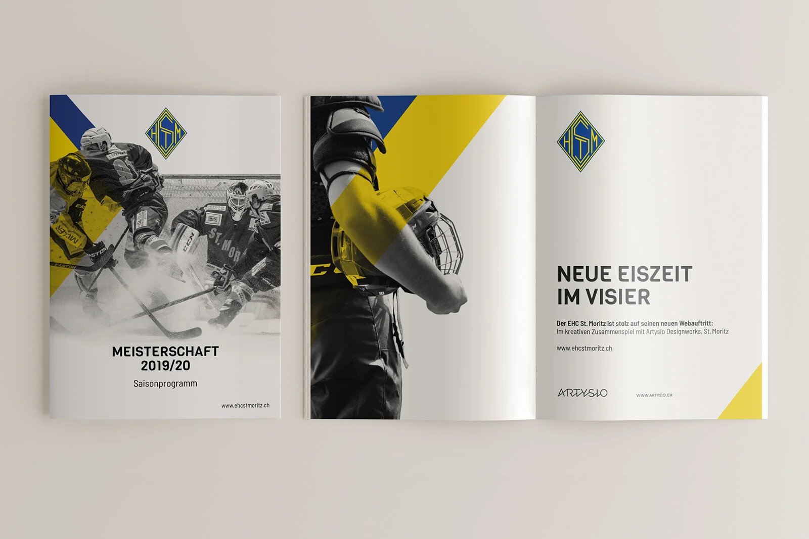
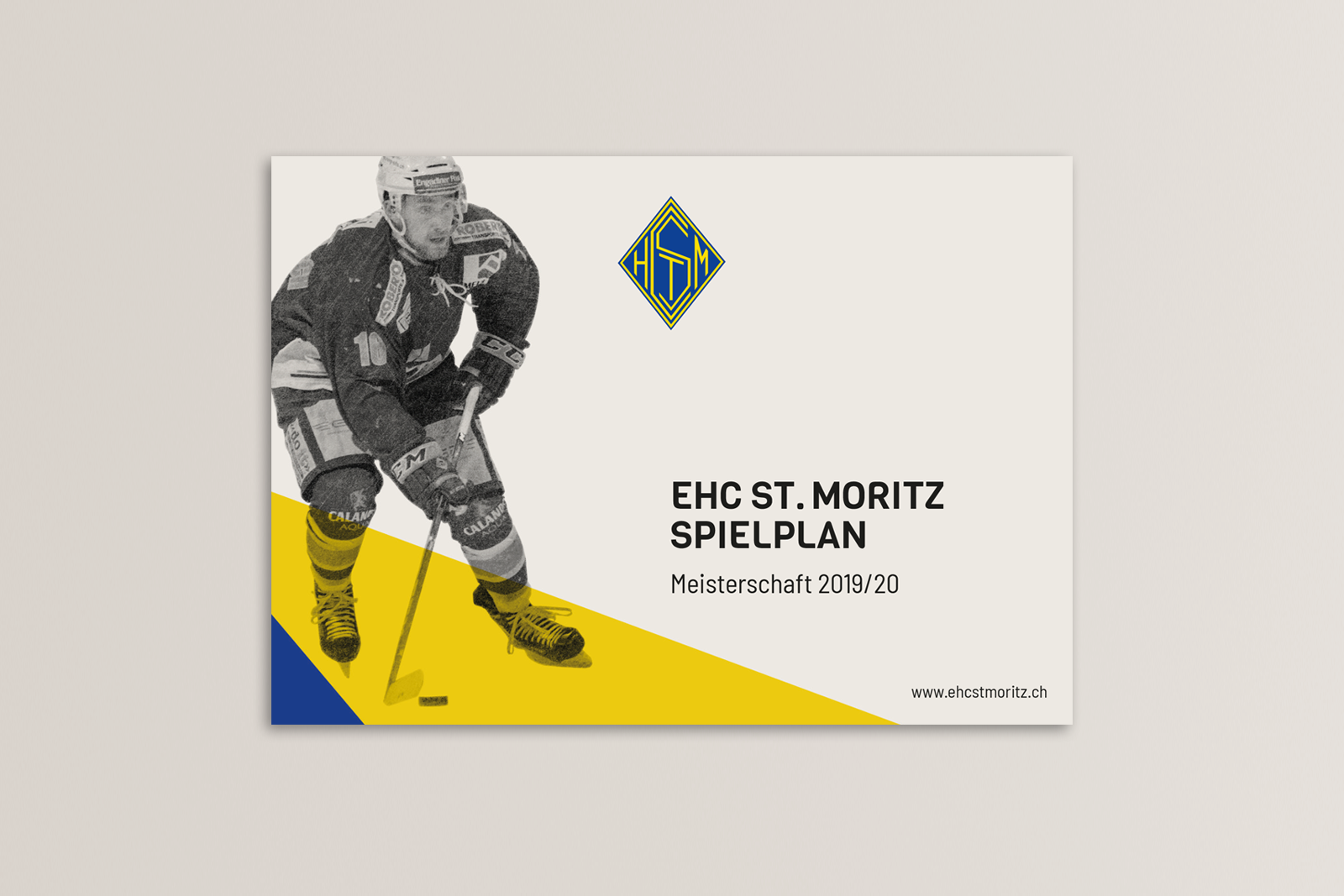
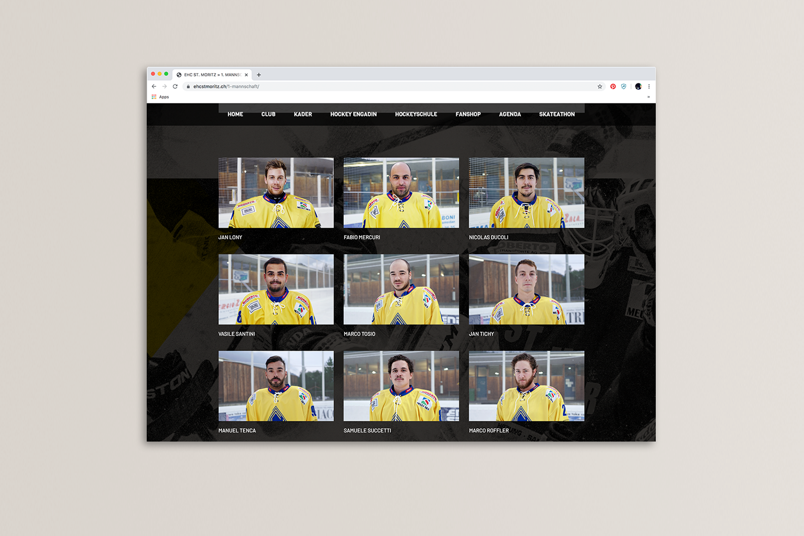
The Engadine Hockey Club St. Moritz wanted a new visual identity for touchpoints from printed material to a new homepage.
It became apparent from the first client meeting that the client was not knowledgeable about “brand strategy” and the process involved. So we had to guide the client through the process, giving them a client journey that informed them about the value of each step for the final creative solution. This was achieved by a comprehensive proposal giving details about the creative process and the steps involved as well as regular updates for the client.
Beginning with a low level “brand audit” looking at the current situation as well as other variables including history, competition and fan profiles. The challenge for this project was to incorporate the client scope as well as insights discovered from the research in a fresh and interesting way. Mixing the important historical story with the need to interest the loyal fans while keeping the brand attractive to possible new fans. Adding to this the importance to position the club brand as one that is attractive to parents who are interested in training their children for the next generation of players.
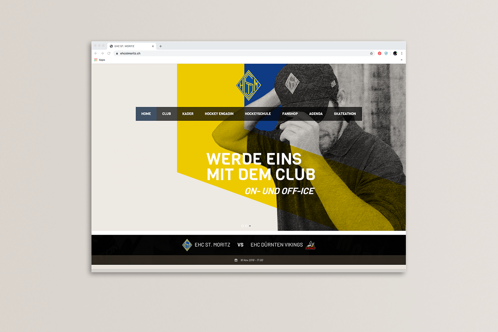
After discussions and brainstorming concepts with the creative director, I created “moodboards” to be presented to the client for the new direction of the visual identity. An approach was chosen that would have a a visual language that incorporated colours which gave a nod to the history while adding the club colours in unexpected ways, while the images were black and white with a subtle ice texture to express the excitement and warrior archetype of the hockey player.

